
Comics Writer No More pensketch cover – about 8.5″x11″ pen on paper in Sketchbook 78
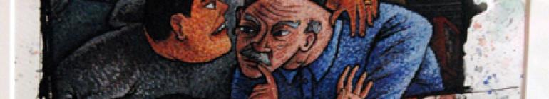
Comics Writer No More pensketch cover – about 8.5″x11″ pen on paper in Sketchbook 78

Diegetic Panelization – 18 October 2016, pen on paper about 5″x8″
Posted in Invention, Work on Paper
Tagged Alan_Moore, American_Gothic, comics, Harvey_Kurtzman, Henrik_Drescher, meltthology, Scott_McCloud

GWW brochure page – designed by Hyperakt
Above is a page from a brochure developed by Hyperakt for the Gotham Writers Workshop, using a base drawing of mine (below) Continue reading
Posted in Graphic, Landscape/Streetscape, Sketchbook, Urban Scene
Tagged art, Bronx, brush_pen, Gotham_Writers_Workshop, Hyperakt

Drawing of Sarcastic Thug Comic Book Cover, black and red pen on paper in Sketchbook No. 69, 10 November 2014, about 8.5″x11″
I was in an L.A. Eco-Village meeting last night and I had my sketchbook (No. 69) with me to help pass the time. I started to letter “Sarcastic Thug” and kept tooling around Continue reading
Posted in Graphic, Invention, Sketchbook, Work on Paper
Tagged Alan_Moore, art, comics, drawing, fan_art, Hilary_Barta, Kirby_Dots, Sarcastic_Thug, Splash_Brannigan, superhero

Mazie Ofrane Footprint, watercolor on paper, January 2014, 6″x6″
I did a series of watercolor foot and hand prints for our neighbors. Continue reading
Posted in Graphic, Invention, Work on Paper
Tagged art, baby, footprint, hand, hand lettering, handprint, Mazie_Simone_Ofrane, watercolor

Santa Bridge Illustration, ink and watercolor on paper, December 2013, about 8″x8″
This is an illustration job I did for my friend’s wife’s business’s 2013 holiday card. Continue reading
Posted in Invention, Work on Paper
Tagged bridge, MIC_Consulting, Santa, Santa_Claus, suspension_bridge

Maeve Margaret Linton Lincourt footprints with hand lettering, watercolor on paper, 9 September 2013, 7″x10″
This post shows three pieces that I did in watercolor on paper that commemorate my daughter Maeve Margaret Linton Lincourt Continue reading
Posted in Graphic, Invention, Work on Paper
Tagged art, baby, foot, footprint, hand lettering, Maeve_Margaret_Linton_Lincourt, watercolor
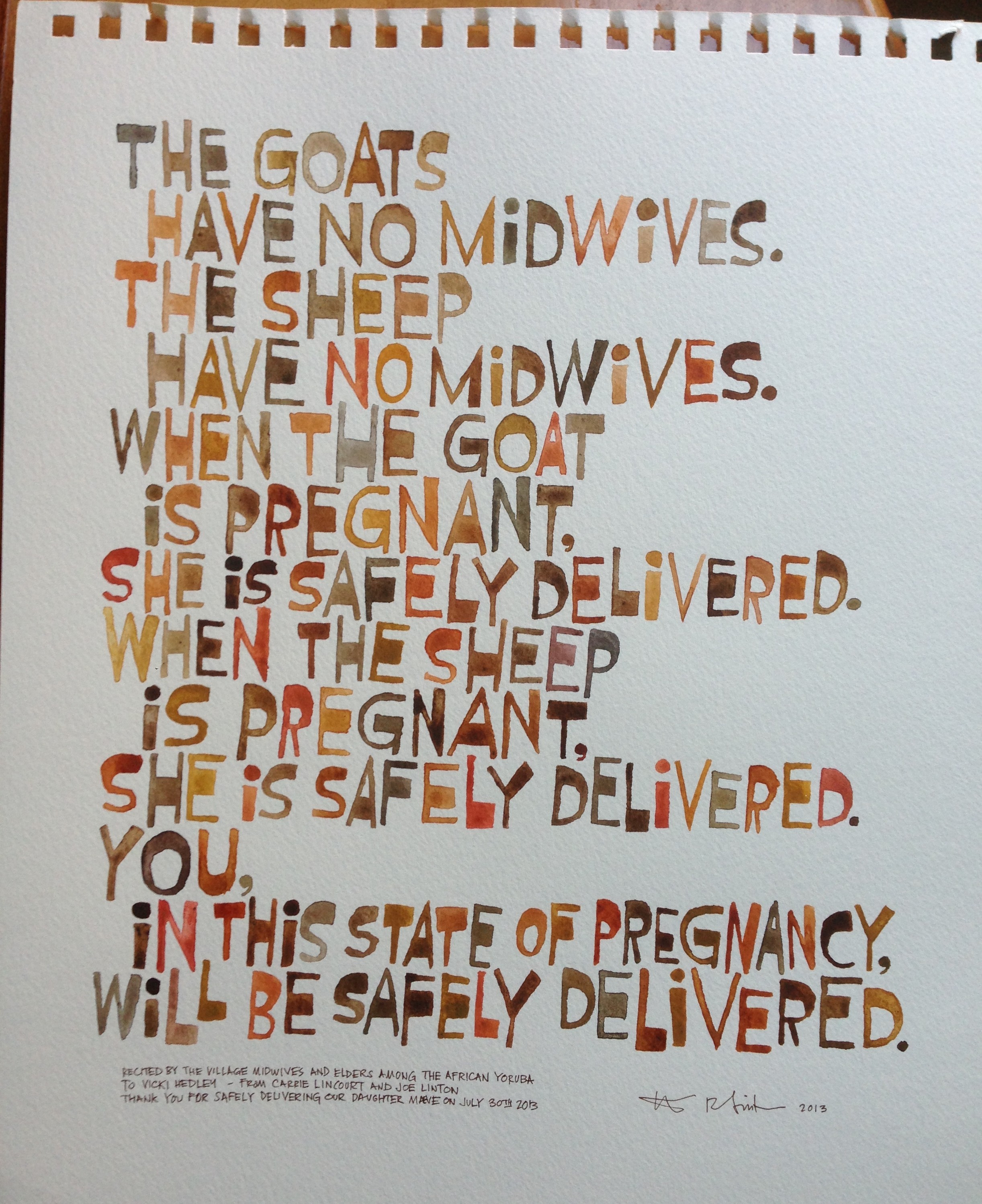
The goats have no midwives, watercolor on paper, September 2013, about 11″x17″
This is a lettering project I did as a gift for the homebirth midwife Continue reading
Posted in Graphic, Invention, Work on Paper
Tagged art, Ben Shahn, consistency, goat, hand lettering, midwife, watercolor

Cover of Sketchbook No. 67, 2013, about 8.5″x11″
I finished another sketchbook – my 67th. Continue reading
Posted in Observation, Portrait, Sketchbook, Urban Scene, Work on Paper
Tagged art, baby, brush_pen, Carrie_Lincourt, Maeve_Margaret_Linton_Lincourt, passenger, rider, sketch, sketchbook, subway, train

One-armed man riding the 2 train sketch, pen on paper in Sketchbook No. 68, 23 August 2013, about 8.5″x8.5″
A quick post with three drawings from my current sketchbook – number 68. Continue reading
Posted in Figure, Observation, Portrait, Sketchbook, Urban Scene, Work on Paper
Tagged art, brush_pen, New_York_City, passenger, rider, sketch, sketchbook, subway, train, transit
